About the LHT
The Library of Historical Types
Partial Metadata Schema
The Library of Historical Types
Partial Metadata Schema
The Library of Historical Types
Partial Metadata Schema
|
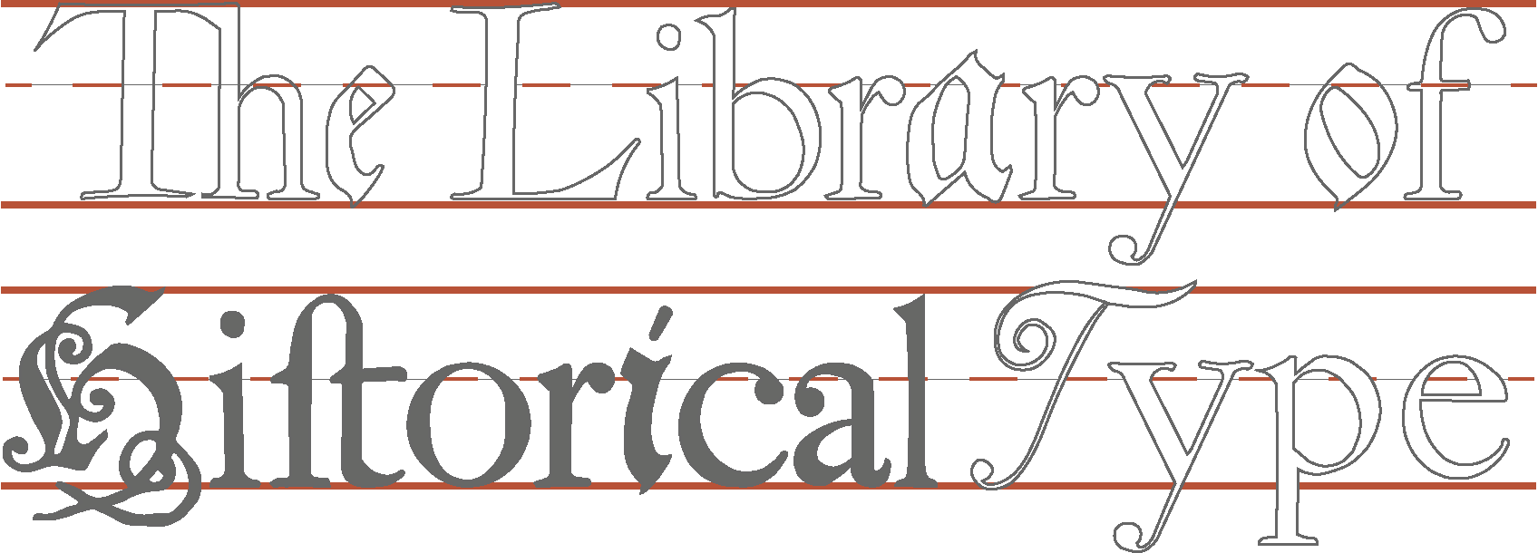
Middle: William Caslon, “English Roman No. 1,” from A Specimen of Printing Types (1785), digitized for the Library of Historical Types Top:"English Black Letter No. 1" from Typefoundries in the Netherlands by Johannes Enschede, digitized for the Library of Historical Types Bottom: William Bulmer, “Bulmer-Martin Shakespeare Press Roman (1821)” from A Bibliographical, Antiquarian And Picturesque Tour In France And Germany by Thomas Frognall Dibdin, digitized for the Library of Historical Types |
Context
The Library of Historical Types will attempt to provide accurate digital reproductions of the glyphs from type specimens by such historically important type designers as William Caslon, J.F. Rosart, Pierre Simon Fournier, Giambattista Bodoni, and William Martin. The goal of the Library of Historical Types will be to allow graphic design students and scholars of type history to directly compare the design of historical types reproduced from primary source documents in the form of original type specimens published by type designers to advertise their types.
Why is such a resource useful, and why is it important that it be based on primary source documents? Consider the three versions of the title at the top of this page, the first produced from a direct digitization of the “English Roman No. 1,” from type designer William Caslon’s 1785 Specimen of Printing Types, the second an adaptation (or homage, if you will) of Caslon’s type designed for the Adobe Corporation, and the third a digitization of J.F. Rosart’s “Great Primer Roman No. 782”.
AAABBBCCC
The power of juxtaposition is how it allows us to see qualities of type we might not have noticed when looking at the types in isolation. We can see in these three examples that Adobe’s “Caslon” is wider than Caslon’s 1785 English Roman and has far more dramatic thicks and thins, including serifs and brackets that are mere lines as opposed to the flared serifs and brackets of the 1785 Caslon type. In fact, its dramatic thicks and thins bear more in common with J.F. Rosart’s 1745 “Great Primer Roman,” though the Rosart type appears darker in color due to its thick-thin contrast being just a bit more severe than the Adobe Caslon type. Finally, the red, blue, and yellow lines seem to indicate that the “English Roman No. 1” has the lowest X-height, Adobe’s Caslon the next highest, and the Rosart type the very highest x-height of the three types.
What this example shows is that digitizing historical types and enabling users to juxtapose them allows types to be studied and analyzed with greater precision. Users can make informed judgments, for example, about whether a modern type described as “Caslon” actually reflects a type of the designer it is named after, or if it reflects the influence of multiple historical types. Specific anatomical features, such as brackets and widths and x-heights, can be compared on a character-to-character basis, and we can specify what exact qualities make one type seem “darker” or “lighter” than another.
Content
The content of the website will be as follows:
- Each individual type sort will be digitized into a downloadable TrueType font. Each font will be titled according to the formula [creator] [(sourceDate)] [typefaceSize] [typefaceGroup] [number], as in “J.F. Rosart (1745) Great Primer Roman 538.”
- The website will have a Type Comparison page which will allow users to free type two layers of text on top of each other using fonts uploaded to the website. They will be able to freely resize the type for the sake of comparison.
- Historically significant type designers will have their own pages providing biographical information and a bibliography of resources about this creator, as well as links to digitized types by that creator.
- Each digitized font will contain metadata showing the size and resolution of the original image it was digitized from, as well as providing the size of the font using traditional font size nomenclature.
- Each digitized sort of glyphs should contain metadata that links the images to the digitized source they were taken from. This will enable users to see and discuss how these types were presented in their original context.
- Links will also be provided to primary sources printed with the types in question, which will enable users to investigate how different types were used by printers – the customers and end-users of the punches sold by the type designers.
The content may eventually include borders and printers’ devices which are also included in type specimens, but for now the primary content will be digitizations of historical types.
Users
Create an online library of glyphs would allow art history and graphics design students and scholars of bibliography to directly compare the glyphs from one designer’s types to those of another designer’s type. The biggest obstacle to such comparison is that differences between types can be exceptionally subtle and difficult to discern with the untrained eye. The Library of Historical Types can provide browsing tools that not only enable such direct comparisons, but also provide a way of organizing historical types that allow users to consider types by the geographic location where it was produced, by whether it is Roman, Italic, or the alphabet of some other language, and by what time period it was produced in.
Functional Requirements
In order to search and browse the content on the Library of Historical Types, users will want to be able to search by several different facets. Suppose students are tasked with comparing historical types from the 19th century with historical types from the 18th century? There will need to be a machine-readable Date element that allows types to be filtered by date – and which disambiguates between the Date of the original type specimen, and the date when it may have been Reprinted. If they wish to compare German types with French types, there will need to be a Coverage element.
Perhaps students might be assigned with comparing the features of a Roman type with those of an Italic type: there will need to be a required typefaceGroup element that categorizes these broad groups of type according to a standard vocabulary.
Suppose students wanted to compare a group of types by a single Creator: If the Creator is linked to the LC Name Authority file, then not can the types be found by being linked to that single authority, but so can any number of other resources using the same authority be linked to, allowing users to find any number of publications for which a Fournier or a Caslon or a Baskerville was either Creator or Contributor.
Assuming users are able to find the types they wish to compare, they will then need a way to download them or find and display them on the website for comparison. There will therefore need to be a sophisticated Size element which accounts for the body height and x-height of a sort and can size them relative to the standard web sizing unit em.
They will also want to know the measurements of the source images the types were digitized from and connect to the primary source document or publication to examine the context that the type was taken from, including a citation of the specific figure in a book of type specimens, therefore necessitating a sourceTitleInfo element with a handful of optional sub-elements.
Finally, the Title element needs to have a formula which will give each type a distinct name so that students and scholars writing about different types have sufficiently disambiguating names to refer to. (No two sorts should have the same exact name.)
Element |
Mapped To |
Obligation |
Cardinality |
Vocabulary/Encoding Scheme |
Input Guidelines |
Examples |
|
Title |
dcmi: Title |
Required |
1 |
|
Each font will be titled according to the formula [creator] [(sourceDate)] [typefaceSize] [typefaceGroup] [number]. |
J.F. Rosart (1745) Great Primer Roman 538 |
|
Creator |
dcmi: Creator |
Required |
1-n |
Names should be inputted as listed in the LCNAF. |
Caslon, William, 1754-1833 Updike, Daniel Berkeley, 1860-1941 |
|
|
sourceDate |
dcmi: Date |
Required: <date> Optional: <reprinted> |
1 |
The publication date of the original document – the type specimen, specimen book, or printed source, should be entered under <date>. Under the <reprinted> subfield should be entered the date of the text the specimen is reproduced in, if the digitization is of a reproduction in another printed work. |
<date>1745-00-00</date> <reprinted>1903-00-00</reprinted> |
|
|
sourceTitleInfo |
mods: titleInfo |
Required: <title> Optional: <subtitle> <partNumber> <partName> <nonSort> |
1-n |
|
This is the name of the publication that the type specimen is published in. The main title should be inputted under <title>, and following title text on the title page should be used as the subtitle. If the specimen is represented as “Figure [number]” then the <partName> should be “Figure” and the <partNumber> should be the figure number. If the title starts with the words “A” or “The” they should be put under the <nonSort> tag. |
<nonSort>A</nonSort> <title>Specimen of Printing Types</title> <partName>Figure</partName> <partNumber>134</partNumber> |
|
typefaceGroup |
|
Required |
1 |
‘typefaces (type forms)’ Getty AAT |
This element is to be used for the very broadest classes of type, Roman, Italic, Script, Fraktur, and (potentially) Greek, Hebrew, and other alphabets. It is limited to these broad classes as defined by Getty AAT in order to enable ease of searching. More granular searches for specific font families within these broader groups should be done using the Search function. |
Roman Italic Fraktur Script Greek Hebrew |
|
coverage |
dcmi: coverage |
Required: <spatial> |
1-n |
This element is used to specify the city and country where the creator was active in creating type during their lifetime. |
Amsterdam, Netherlands London, England |